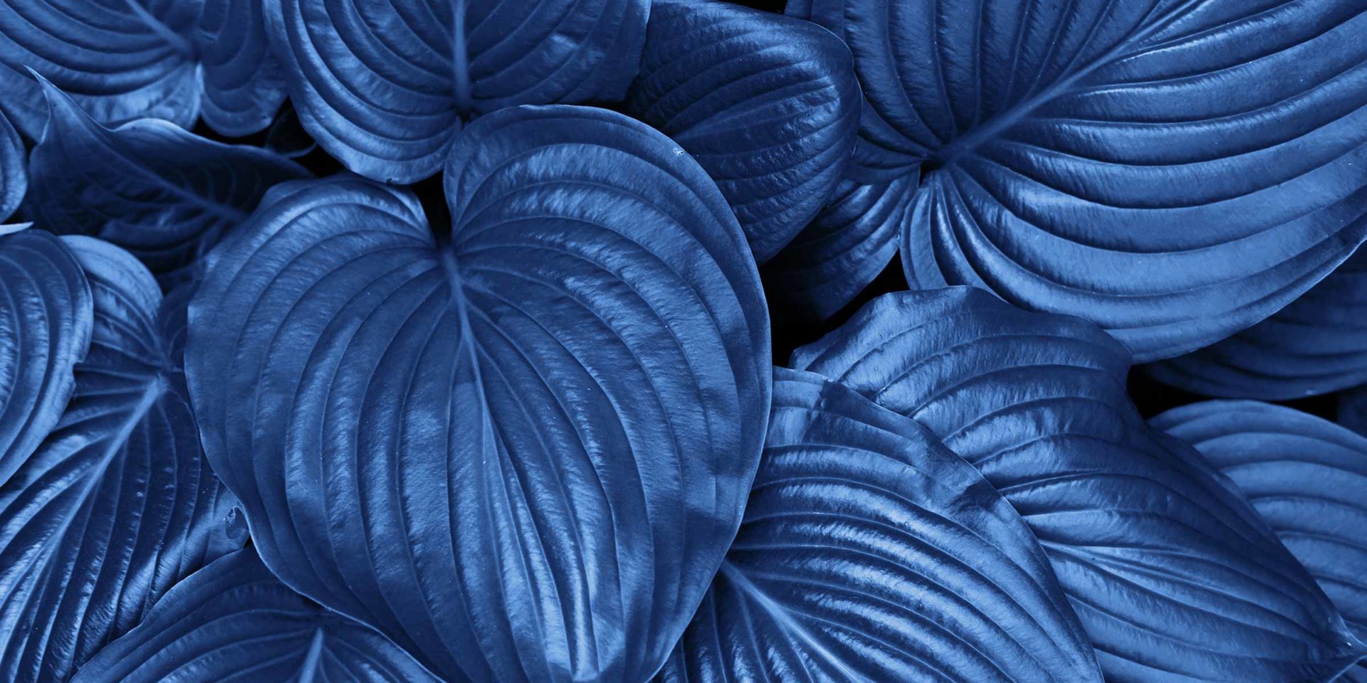

In December 2019, the Pantone Color Institute announced that the 2020 Color of the Year was PANTONE 19-4052 Classic Blue, a staid shade of blue, that’s “reassuring and full of calm and confidence” to counteract the uncertainties of the future.
“We are living in a time that requires trust and faith. It is this kind of constancy and confidence that is expressed by Pantone 19-4052 Classic Blue.”
Leatrice Eiseman, the Executive Director of the Pantone Colour Institute
Pantone’s choice copped a fair bit of criticism in design circles for playing it too safe compared to the flamboyant colours of the past few years, Classic Blue looks too corporate and depressive to have a calming effect – which is essentially at odds with the zeitgeist.
Fast forward four months later, and the uncertainty of the future has only escalated – Australian bushfires, global health crisis and a looming recession. Is Classic Blue still the colour we need?
A trend still emerging
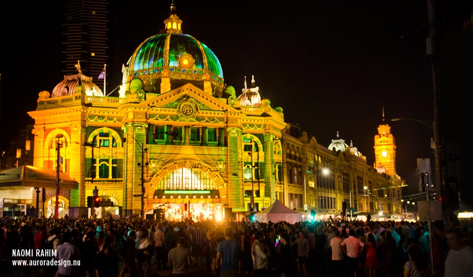
Blue has been a strong trend in digital design for the past two years, and was largely predicted to be used in a much more muted (pastel) palette. More broadly, over the last decade, we’ve seen a range of rebranding favouring the lighter shades of blue in their colour system – particularly in digital design, because it appears more positive and fresh – ANZ, Google, KPMG and Durex are recent examples.
Rebranding with Classic Blue
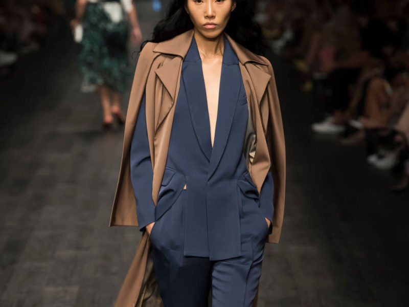
Deeper blues are synonymous with trust, confidence and stability, making it a popular choice for use in the corporate, technology and finance sectors.
In 2019, Volkeswagen unveiled their rebrand featuring a flat white logo design on a dark blue background, to herald in the electrified car era. Visa Secure also unveiled a revamped logo featuring a flat logo in a darker shade of blue, to align with their brand messaging.
How to use Classic Blue
As creatives, how we use Classic Blue in our graphic design, user interfaces, illustration and photography will be the difference between this hue being dynamic or drab.
Like Navy, Classic Blue can be used like a neutral colour – pairing it with other colours can give it new meaning. Used sparingly with white, will give designs a serious and authoritative tone. When used with gold, it can appear quite elegant. Alternatively, pair it with orange, light blue and brown for a more retro feel. For a contemporary look, contrast Classic Blue with light pink, coral or lime.


Classic Blue for communicating the health crisis
Classic Blue may just become the colour of choice to communicate important information during the pandemic. Blue has long been associated with the medical industry for it’s clinical yet calming affect. As the need for contactless and online services increase, this shade could be particularly effective for public service announcements, graphs/charts and app interface design, for a clean and reassuring presence.
View this post on Instagram
View this post on Instagram
Final word
Classic Blue is very easy to incorporate into your designs, many companies already include a similar shade in their primary or secondary palettes. How you contrast and compliment it with other colours will be the modern spin that visual communication calls for right now.
Read more: Pantone’s Colour of the Year 2020